Concised Design Document
Title: Tommy and the Vegetables
Task: Children’s Story E-Book
Theme: Food
Concept
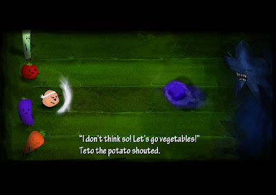
The team decided to go for the approach of having the vegetables as the key protagonists of the story, along with the human children. The antagonist would be the bad bacteria that come about when the children do not have a balanced diet and end up falling sick.
We felt that this approach to the project can allow the readers to relate themselves with the children in the story. The plot was designed to be easy to follow and understood without complication, which is important as our target audience is children aged 7 to 9.
From a design perspective, this enabled us to make a traditional approach in representing the characters, such as bright colours for “good” and dark colours for “bad”. The regular shapes of vegetables and bacteria are simpler to create and hence more feasible with the short production schedule for this assignment.
The rough outline entailed the vegetables fighting off germs and the lessons learnt was one of proper nutrition (getting more vitamins and minerals), eating more vegetables and sticking to food pyramid guidelines.
Storyboarding
Setting:
• A small, quaint-looking town
Characters:
• Tommy — Young boy who likes to eat Candy, the protagonist
• Lisa — Young girl (sister) (likes to eat candy)
• The Candy Shop Owner
• Teto — A Potato having a combative personality
• Jalto — A Brinjal/Eggplant/Aubergine having a timid personality
• Reto — A Carrot
• Leto — A Celery, having a worrisome personality
• Meto — A Tomato
• Bacti — A group of bacteria that than congregate into a larger form called Vario
Storyline:
The storyline follows a tension, climax and resolution phase.
The premise — Tommy and his sister, the townsfolk and the vegetable friends live uneventfully in a town.
Tension — One day a candy shop opens in town, giving out free candy. Tommy, a candy lover, starts to skip meals to eat candy. The other children soon follow suit. Soon they fall sick and they start spreading germs. The vegetable friends are worried. Time passes and the germs grow stronger.
Climax — Suddenly the oversized germs attack the town. The vegetables fight off the germs.
Resolution — The town is saved and the grateful children want to stop eating candy altogether. The vegetables advise them to have a balanced diet with lesser candy instead. The children take the advice and the story ends happily.
Moral of the Story — It is important to eat a balanced meal as stated by the food pyramid. It is a form a courtesy to thank the person that has helped us. Problems can be overcome with teamwork
Design and Layout
Header/Title Font: Hobo Std, size 108 and 51
Body Font: Tekton Pro, size 36
Colour Scheme:
Since it is a design for a children’s e-book, brighter and bolder colours were used. In addition to that, a liberal amount of textures and brushstrokes accompany the frames in order to soften the impact of the vector graphics.
Texture Scheme:
To balance out the impact of the vector graphics In addition to that, a liberal amount of textures, brushstrokes and line blurring are applied to all the frames.
Setting Colour:
Initially the setting will be very bright and cheery, when the Bacti have not begun to cause trouble. Later, when the Bacti begin to attack, a lot more blurred shadows are used and the colours will be heavily muted. The painted border of each page also changes to reflect this, from white paint strokes to increasingly darker strokes.
Vegetable Colours:
To make the vegetables attractive, a focus on, bright, vibrant colours were used and the choice of vegetable naturally matching that colour. However, in tune with the watercolour style used for the entire book, the colours were toned down, helping to soften the impact of vector graphics.
Bacti Colours:
Dull colours were used to make the germs seem dark and scary. Furthermore, the germs are painted unevenly to give the impression of “speckly”, or dust-like appearance.
Components of Interactivity:
The project is designed with interactivity in mind to keep the readers interested. The final version of the e-book is intended to have its own online viewer and animated elements powered by Flash.
The design incorporates some elements of traditional pop-up books, such as pull-tabs and slider-tabs. A page (day-night transition) have been developed with animated elements to demonstrate the team’s direction towards interactive components. There are also plans to implement the story from another point of view of Tommy’s sister, named “Lisa’s Story”. This may be developed after the term ends.
Another component of interactivity lies with the script whereby the main character, Tommy, asked questions to himself. These monologues encourage readers to give their answer as they read the story.
Team Member
Victor Chua Fu Kuan
Muhammad Sadiq B Samsudin
Nicholas Yau Lih Kang


No comments:
Post a Comment