
The first part of the assignment is to gain familiarity with three different online visualisation tools. I refer to an article by Sharon Machilis to choose the three tools that I will be working with for this assignment. The tools can be categorised by skill levels, which then motivates me to choose one tool from each level. I have the assumption that a higher skill level will imply that the tool will have more complicated functions thus might be the best tool for any type of visualisation. For level 1, I decided upon Many Eyes by IBM. Although I have used this tool in several occasions for NM3229, this will give me an in-depth exposure to this entry level visualisation tool. For level 2, I have chosen Zoho Reports since it is the only one labelled as visualisation app/service. For level 3, I go with Tableau Public to explore more about this visualisation tool. Since I am somewhat familiar with Many Eyes and Tableau Public, I spend more time on Zoho Reports to familiarise myself with this tool. I use the data set "2012 QS World University Ranking (Southeast Asia & Middle East Data)" that has been created for Assignment 2 to test it on Zoho Reports. I managed to get a decent scatterplot with this tool. The main difference that I see between the scatterplot in Zoho Reports and that in Tableau Public is that Zoho Reports does not allow split view such as to compare between regions. I also use the same data set to create a visualisation in Many Eyes. Many Eyes is less interesting in a sense that the colours are the same among the institutions. It has the same limitation as Zoho Reports such that it does not allow split view to compare between regions. The following are the 3 visualisations created using the same data set, arranged based on ascending skill level i.e. Many Eyes, Zoho Reports and Tableau Public.
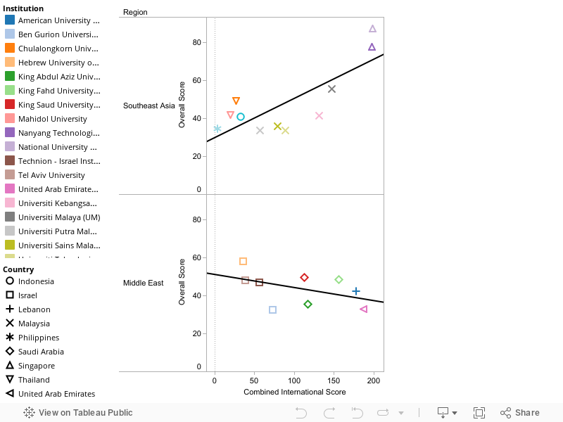 After comparing these 3 visualisation tools, it should be noted that my main finding from Assignment 2 about the different trend lines among the regions can only be discovered through Tableau Public, and not the other 2 visualisation tools. Both Tableau Public and Zoho Reports have the advantage over Many Eyes in that they are able to do filtering of data.
Moving on to the second part of the assignment, I am supposed to examine the data set by National Nutrient Database for Standard Reference - From the USDA. This part of the assignment requires me to generate and write down a few hypotheses to be considered, tasks to be performed, or questions to be asked about the data elements.
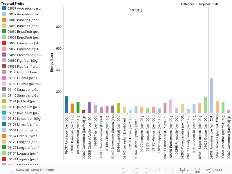
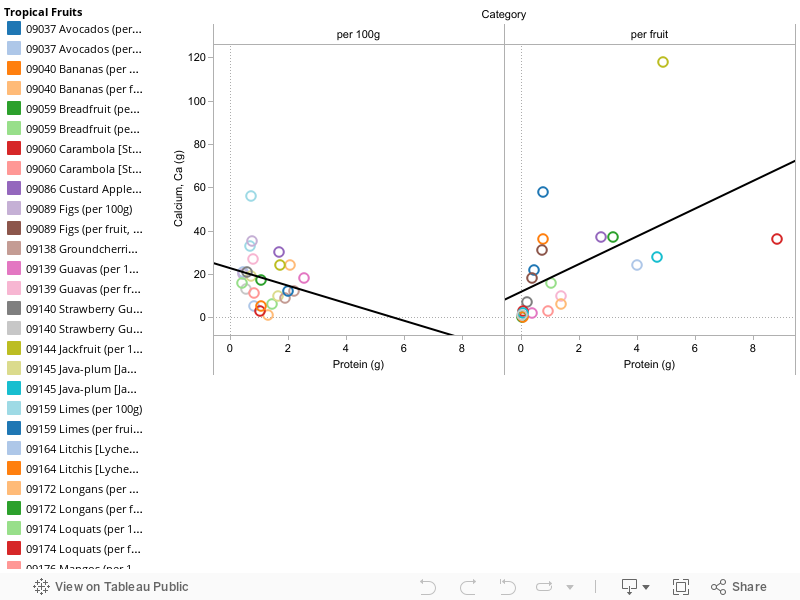
After looking through the database, I have decided to do an analysis based on tropical fruits. The definition of tropical fruits that I take is based on the list given by tropicalfruitandveg.com. I then search for those fruits from the database and manage to gather a data for 25 different tropical fruits. The fruits are chosen based on raw fruits. I extract out the data from the Proximates section, Calcium and Vitamin C. Calcium is specifically chosen from the Minerals section due to its importance for the body, and it being regarded as a major mineral (MIT). Vitamin C on the other hand is chosen specifically from the Vitamins section as it is a type of vitamin commonly found in fruits, and it has many benefits which may include "protection against immune system deficiencies, cardiovascular disease, prenatal health problems, eye disease, and even skin wrinkling" (WebMD). I extracted the information for per 100g and per fruit for my analysis. As for per fruit, it is chosen based on the given data, Nutrition Labeling and Education Act (NLEA) suggested serving, medium size or small size (whichever comes first). After getting the raw data, some cleaning-up needs to be done. I need to remove the information for fibre and sugar since there are missing data. I have to transpose the data to allow the visualisation tools that I am going to use later to be able to read the data properly. The cleaned up data looks like the following.
The next part of the assignment is to load and examine the data set into the systems. The visualisation tool should be used to formulate the questions above. The questions that I have can be categorised into two types, namely one that require a comparison of a single variable and one that require a comparison between two variables. For that, I create two types of visualisation for every tool. First one is the bar chart, and the second one is the scatterplot. The following are the sample visualisations created. I have arranged the visualisations according to type of visualisation and the skill level required.
Bar Chart
Scatterplot
The different visualisation tools do have their own pros and cons, and
choosing the right tool is crucial to be able to formulate the questions. For
both bar graphs and scatterplots, Many Eyes did a good job in enabling the
public to choose which variable they want to look at. Zoho Reports and Tableau
Public on the other hand are rigid such that the creator has to choose the x
and y-axis for the public. However, those two latter visualisation tools have
the ability to show the variable based on categories i.e. per 100g or per
fruit. This proves to be useful if the public wants to compare only among
fruits. Tableau Public can even show the categories side by side. This might be
useful if comparison between categories needs to be made. All three
visualisation tools allow the public to highlight specific fruits that they
want to include or exclude. This is very useful since the public can choose to
compare, for example those fruits that he or she consumes on a regular basis.
Many Eyes and Tableau Public is able to highlight certain fruits while leaving
the rest in the background. Zoho Reports and Tableau Public are able to
highlight certain fruits but it removes the rest off the screen. In short,
Tableau Public has the advantage in that it can do both, either keeping the
rest in the background or removing them off the screen. The public is able to
perform the function of sorting the data when using Many Eyes but for the case
of the other two visualisations, it can only be done by the creator. Lastly,
Tableau Public has the unique function of creating a trend line, which is
useful to give a clearer picture for relationship between variables. As a
conclusion to the pros and cons, it is important to note who is using the tool
since the limitations and advantages differs between creator and public.
Below is the summary of the system's strengths and weaknesses.
Moving on to the second part of the assignment, I am supposed to examine the data set by National Nutrient Database for Standard Reference - From the USDA. This part of the assignment requires me to generate and write down a few hypotheses to be considered, tasks to be performed, or questions to be asked about the data elements.
After looking through the database, I have decided to do an analysis based on tropical fruits. The definition of tropical fruits that I take is based on the list given by tropicalfruitandveg.com. I then search for those fruits from the database and manage to gather a data for 25 different tropical fruits. The fruits are chosen based on raw fruits. I extract out the data from the Proximates section, Calcium and Vitamin C. Calcium is specifically chosen from the Minerals section due to its importance for the body, and it being regarded as a major mineral (MIT). Vitamin C on the other hand is chosen specifically from the Vitamins section as it is a type of vitamin commonly found in fruits, and it has many benefits which may include "protection against immune system deficiencies, cardiovascular disease, prenatal health problems, eye disease, and even skin wrinkling" (WebMD). I extracted the information for per 100g and per fruit for my analysis. As for per fruit, it is chosen based on the given data, Nutrition Labeling and Education Act (NLEA) suggested serving, medium size or small size (whichever comes first). After getting the raw data, some cleaning-up needs to be done. I need to remove the information for fibre and sugar since there are missing data. I have to transpose the data to allow the visualisation tools that I am going to use later to be able to read the data properly. The cleaned up data looks like the following.
+%5BScreenshot%5D.jpg) |
| Snapshot of the Data Set |
The possible questions that I will analyse based on the above data set are:
- Which tropical fruits give the most energy?
- What is the relationship between energy and fat?
- For someone who is on calcium diet, what kind of tropical fruits are recommended to be taken?
- Increasing protein intake increases urinary calcium loss (The American Journal of Clinical Nutrition). Which tropical fruits have a relatively higher than average amount of calcium when compared against its protein content?
- Which tropical fruits have the highest content of Vitamin C?
Bar Chart
Scatterplot
There are several interesting findings that I got
from the visualisations. From Many Eyes, it is clear that Durian as a fruit
gives the most amount of energy to the consumer. This can be done easily using
the sort function. For per 100g, it is difficult to compare since Many Eyes is
not able to separate between 100g category and per fruit category. Using Zoho
Reports (creator view), it can be seen that Durian is ranked second in terms of
energy content per 100g while Avocado is ranked first. Durian is thus a good
source of energy. Tableau Public is the right tool when comparison between
categories is needed. For Vitamin C, it is interesting to note that Durian as a
fruit and per 100g provides more vitamin than Bananas, another popular tropical
fruit in Singapore. Tableau Public also has the function of trend line, from
which I can find out that there are 8 fruits which have a relatively higher
amount of calcium, when compared against its protein content. Mango, limes,
papaya and pineapple are among those fruits. Pineapple however tops the chart
for this case. In fact, Pineapple as a fruit has a relatively high water
content (1st), high energy content (2nd), high calcium
content (1st) and high Vitamin C content (1st). For those
who are concern about being fat, they need not worry too much when consuming
Longan since it has the least fat per fruit and per 100g. It is however important
to note that there is a high positive correlation between energy and fat that
is fruit that gives higher energy also contains a relatively high amount of fat.
This is expected since fat is among the source where energy is obtained, albeit
there is a need to convert the fat into energy. Longan is thus the least useful
fruit where energy is concerned. In line with this issue, it can be noted that fruits
such as Durian and Pineapples have a relatively higher amount of energy, when
compared against its fat content. On the contrary, Avocados has relatively higher
amount of fat, when compared against its energy content. As a conclusion to the
findings from the dataset, Durian and Pineapple have the potential of giving
consumers more benefits than the other fruits.
Below is the summary of the system's strengths and weaknesses.
Public View
|
|
Many Eyes
|
Zoho Reports
|
Tableau Public
|
|
Selecting variables
|
Yes
|
No
|
No
|
|
Sorting variables
|
Yes
|
No
|
No
|
|
Multiple Highlights
|
Yes
|
No
|
Yes
|
|
Single Highlight
|
Yes
|
Yes
|
Yes
|
|
Filtering
|
No
|
Yes
|
Yes
|
|
Selecting categories
|
No
|
Yes
|
Yes
|
|
Split view
|
No
|
No
|
Yes
|
|
Trend lines
|
No
|
No
|
Yes
|
Creator View
|
|
Many Eyes
|
Zoho Reports
|
Tableau Public
|
|
Selecting variables
|
Yes
|
Yes
|
Yes
|
|
Sorting variables
|
Yes
|
Yes
|
Yes
|
|
Multiple Highlights
|
Yes
|
No
|
Yes
|
|
Single Highlight
|
Yes
|
Yes
|
Yes
|
|
Filtering
|
No
|
Yes
|
Yes
|
|
Selecting categories
|
No
|
Yes
|
Yes
|
|
Split view
|
No
|
No
|
Yes
|
|
Trend lines
|
No
|
No
|
Yes
|
No comments:
Post a Comment