This project is done as a group and the members are Ang Yuan Xia, Muhammad Sadiq Bin Samsudin and Yeo Yak Huan.
We started by looking at several topics which might be of interest to the people around the world. This includes topics such as crimes around the world, world religion, issues concerning women, the state of children around the world, and terrorism around the world. After some discussions and careful consideration, we have decided to work on the topic on terrorism.
We explore the dataset on terrorism which is derived from Global Terrorism Database (GTD) by the National Consortium for the Study of Terrorism and Responses to Terrorism (START), using Tableau Public 8.0 as our visualisation tool. Terrorism is chosen as the choice of our research focus as it is a global concern, and it has social, political and economic implications on the affected countries. Tableau Public is chosen as the tool for us to explore the dataset as it has many sophisticated functions which includes selecting variables, sorting variables, single highlight, multiple highlights, filtering, selecting categories, split view and trend lines. These functions are crucial in helping us formulating new ideas about the dataset. In this blog post, we document our design process in exploring the dataset on terrorism, and does not arrive to any conclusion regarding the issue but it gives people a macro perspective on the global terrorist activities.
GTD defines terrorism as “the threatened or actual use of illegal force and violence by a non-state actor to attain a political, economic, religious, or social goal through fear, coercion, or intimidation” (GTD,2012). They have their own inclusion criteria as to what constitutes a terrorist act which we will not further elaborate in this blog post. We used all 59,786 cases that were already included by GTD for the purpose of this research. The raw data set is shown as below:

After getting the raw data, some
cleaning-up needs to be done. Since there were many variables that can be
looked at, we have decided to focus on only the variables needed and discard
the rest. These variables are namely the year
in which the incident occurred (iyear), country
where the incident occurred (country_txt), region
in which the incident occurred (region_txt), success of terrorist strike as defined by the tangible effects of
the attack that is whether or not the attack type took place (success), general method of attack
(attacktype1_txt), general type of target
or victim (targtype1_txt), nationality
of the target that was attacked (natlty1_txt), name of group that carried out the attack (gname), general type of weapon used (weaptype1_txt), number of total
confirmed fatalities (nkill) and
number of confirmed non-fatal injuries
to both perpetrators and victims (nwound).
We reflect any missing data as
“unknown” instead of excluding the case totally as the latter can have the
implications of skewed data and skewed findings. To allow easier recognition, we
recode the followings:
·
iyear = Year
·
country_txt = Country
·
region_txt = Region
·
success = Success
o 1 = Yes
o 0 = No
·
attacktype1_txt = Attack Type
·
targtype1_txt = Target Type
·
natlty1_txt = Target/Victim Nationality
·
gname = Perpetrators
·
weaptype1_txt = Weapon Type Used By
Terrorist
·
nkill = Total No. of Fatalities
·
nwound = Total No. of Injured
The cleaned up data looks like the
following:

Since there are 11 variables and a
total of 59,786 cases, the possible questions that can be asked are almost
limitless. The general problems that can be focused on can include the number
of terrorist attacks in the different country, people who are affected by the
terrorist attacks, current trends in the type of weapons used in terrorist attacks
and number of fatalities. The target audience who might be interested in the
findings from this dataset can come from various backgrounds such as the
government agency, Interpol, concerned public and organisations who are likely
to be affected by changing social, political and economic climate such as
businesses.
We
devised several hypotheses as a form of guidance for our research:
1.
United States citizens are the most
targeted group for terrorist attacks
2.
Al-Qaeda as the most active terrorist
organisation
3.
The targeted victims of the terrorist
attacks might not be the locals
The next step is to load and examine
the dataset into Tableau Public to formulate the questions above. We started by
looking at the most attacked countries. From the visualisation below, the top 5
most attacked countries are Iraq (7771 cases), India (5300 cases), Pakistan
(5211 cases), Columbia (3733 cases) and Afghanistan (3010 cases). United States
is 25th (569 cases) in the ranking.
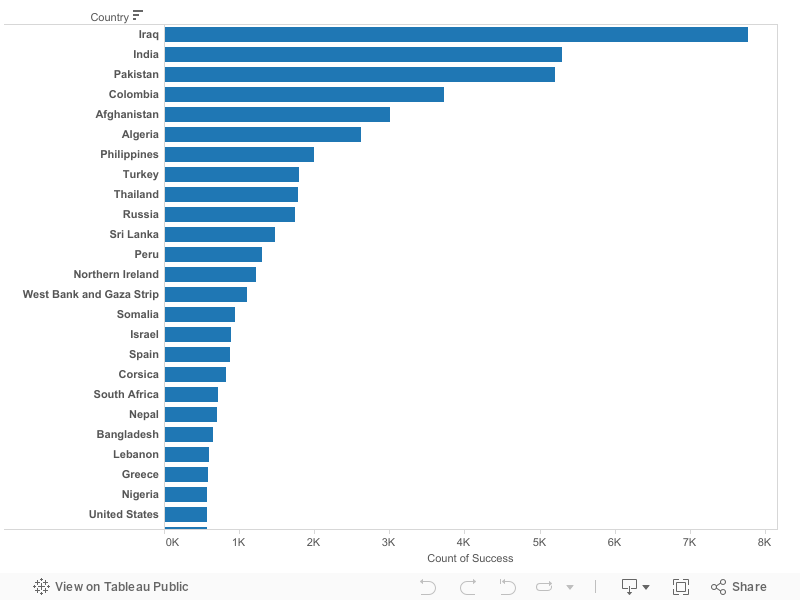
Case 1: Most Attacked Countries
We then looked into the total number of fatalities in the respective countries as seen from the visualisation below. The top 3 countries are similar to that of Case 1: Iraq (26,837 deaths), India (12,680 deaths) and Pakistan (11,188 deaths). United States takes the 12th position with 3246 deaths.
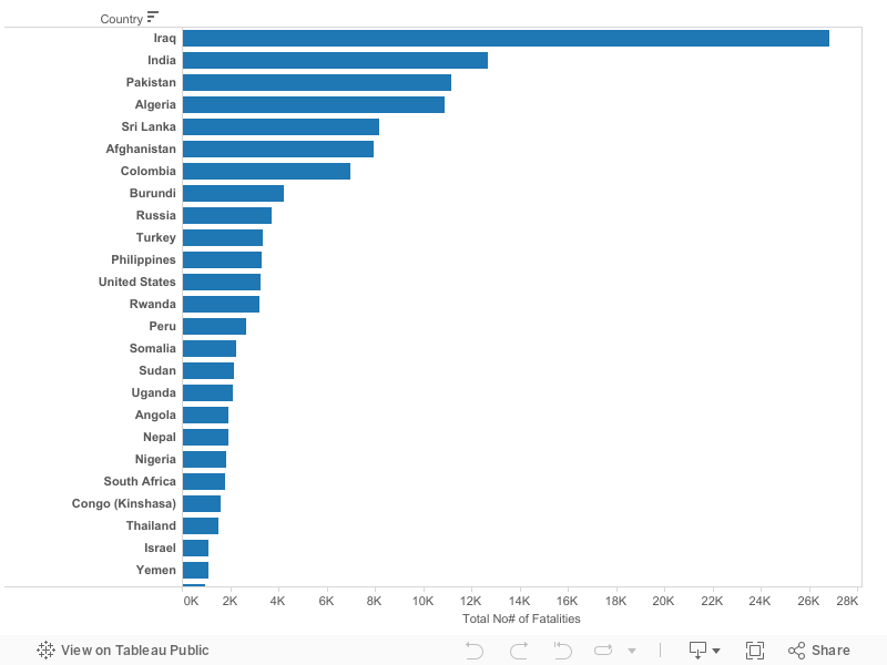
Case 2: Fatalities by Countries
The top 5 most attacked nationalities based on the number of cases, as seen from the visualisation below, is similar to that of the top 5 most attacked countries (Case 1) albeit lower number of cases: Iraq (7293 cases), India (5278 cases), Pakistan (4998 cases), Columbia (3565 cases) and Afghanistan (2688 cases). However, United States rose to the 12th spot in the ranking, with 1618 cases. The first hypothesis where United States citizens are the most targeted group for terrorist attack is false if we were to look at the number of cases.
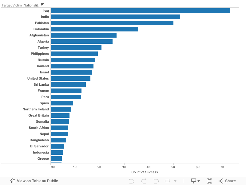
Case 3: Most Attacked Nationalities (Based On the Number of Cases)
Based on Case 1 and Case 3, the third hypothesis where the targeted victims of the terrorist attacks might not be the locals holds true since the number of cases based on top 5 most attacked nationalities is lesser than that of the number of attacks that happens within their respective countries.
If we were to look at the most attacked nationalities based on the number of countries they have been attacked as seen from the visualisation below, the top 5 countries change totally: United States (108 countries), France (68 countries), Great Britain (60 countries), Germany (43 countries) and Italy (42 countries). Interestingly, all of them are from the more developed countries. Iraq, which tops the chart for the previous three cases, falls to the 19th spot (18 countries) in the ranking. The first hypothesis where United States citizens are the most targeted group for terrorist attack holds true if we were to look at the number of countries they have been attacked.
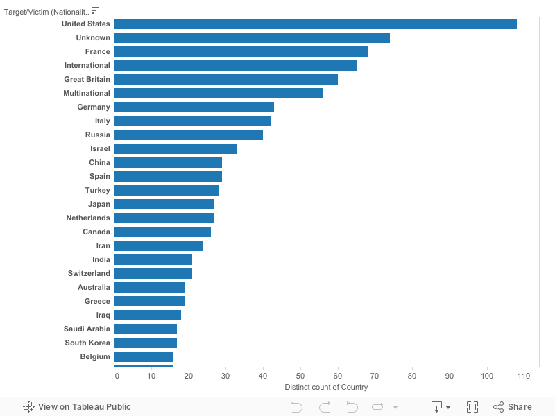
Case 4: Most Attacked Nationalities (Based On the Number of Countries They Have Been Attacked)
We then looked into the total number of fatalities by nationalities as seen from the visualisation below. The top 3 countries are similar to that of the first three cases: Iraq (25,437 deaths), India (12,454 deaths) and Pakistan (10,745 deaths). United States takes the 8th position with 4762 deaths.
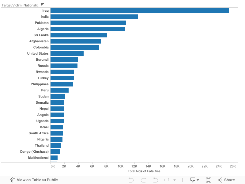
Case 5: Fatalities by Nationalities
Next, we want to look at the most active terrorist organisations. Our second hypothesis which states Al-Qaeda as the most active terrorist organisation is false since Taliban is the most active as seen from the visualisation below, with 2030 cases while the combinations of the 13 different perpetrators which use the Al-Qaeda name forms only 661 cases.
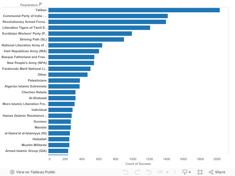
Case 6: Most Active Terrorist Organisations
Although our hypotheses have all been answered, we continue to probe into the data further to look out for insights which might not be discovered just by looking at the raw data alone. Since Iraq is the most attacked country, and that Iraq and United States can both be considered to be the most attacked nationalities, we have decided to look at these two groups in greater detail.
Case 7 looks at the terrorist cases by year for both countries. The number of cases in United States is relatively stable with the lowest in 2006 (6 cases) and highest in 1995 (62 cases). Iraq on the other hand had to face with a consistently increasing number of cases from the period 2001 (3 cases) to 2011 (1306 cases).
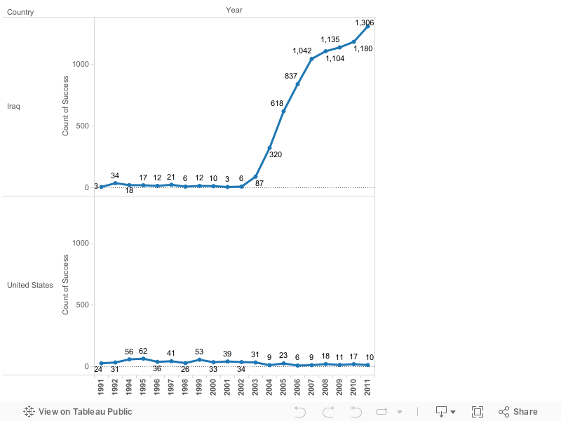
Case 7: Terrorist Cases by Year (Iraq & US)
A closer inspection on the perpetrators responsible for the cases towards both countries (as seen in the visualisation below) reveals some interesting insight. While Taliban is the most active terrorist organisation, they did not launch any attack towards United States. They are however, responsible for 208 cases of attack in Iraq. Al-Qaeda on the other hand, is responsible for 98 cases of attack in Iraq and 5 cases of attack in United States.
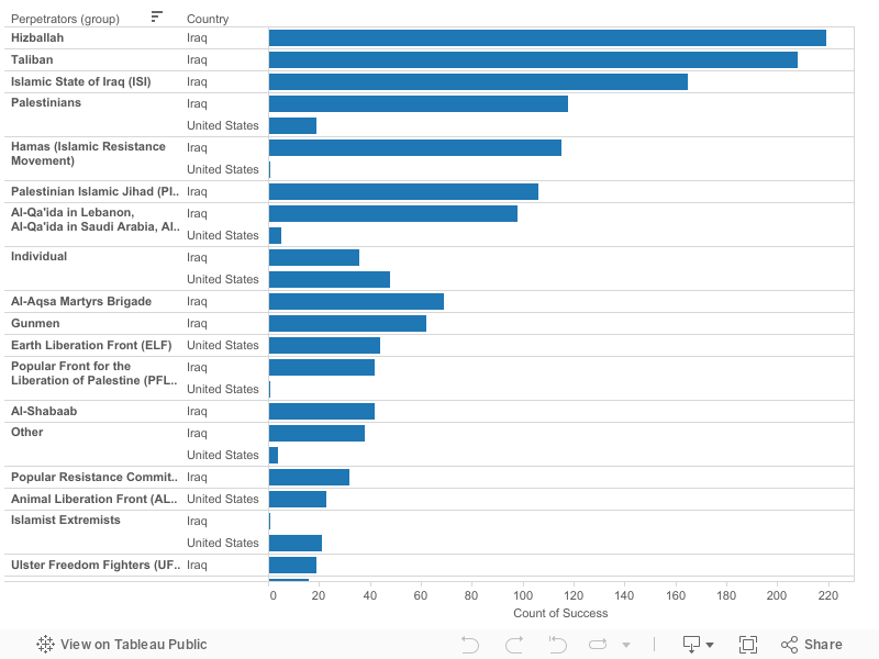
Case 8: Comparison of Perpetrators (Iraq & US) [Countries]
When we look at the perpetrators of the cases towards both nationalities as seen in the visualisation below, it shows that Iraqi has been attacked 204 and 97 times by Taliban and Al-Qaeda respectively as compared to United States citizens who have been attacked 54 and 28 times in the same respect. While Taliban did not launch any attack within United States, it did attack US citizens when they are abroad. It is also interesting to note that both nationalities have several other common perpetrators such as Hezbollah and Palestinians.
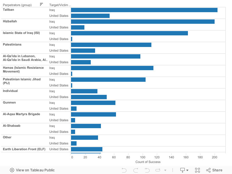
Case 9: Comparison of Perpetrators (Iraq & US) [Nationalities]
Case 10 make a comparison based on target type. The most common target in Iraq is private citizens and property (2659 cases) while the most common target in United States is businesses (139 cases). It is interesting to note that abortion related cases form the 2nd highest target type in United States (133 cases), and it is also the only target type which has more number of cases than Iraq (0 case).
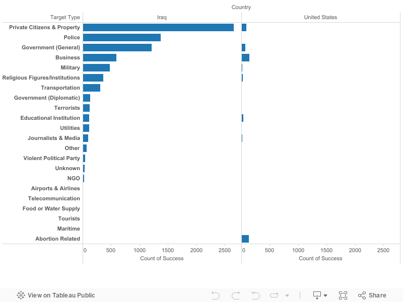
Case 10: Attack by Target Type (Iraq & US)
The final comparison that we make between Iraq and United States is by the weapon type used by the perpetrators when they attack the country. Explosives, bombs and dynamites are a common type of weapon used by the perpetrators in both countries, with 5606 cases in Iraq and 134 cases in United States. While this category tops the chart for Iraq, it is the 2nd most common weapon used in United States. The most common weapon in United States is incendiary, with 291 cases.
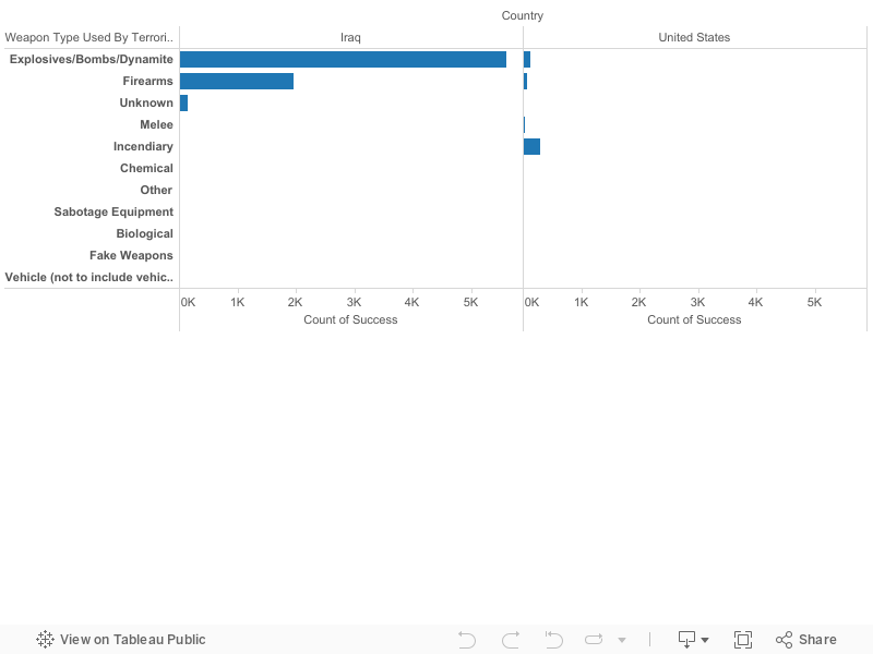
Case 11: Attack by Weapon Type (Iraq & US)
Besides looking at the micro perspective of the cases of terrorism, we have also looked at other macro cases. The following paragraphs will give a brief summary of our other findings while working with the data.
While we are looking at the terrorist cases by year as seen in the visualisation below, there are several countries that caught our attention. El Salvador and Nicaragua for example, had a relatively high number of terrorist cases in the 1990s, but the cases died down after 1997 and 2000 respectively. While looking at the peaks of the cases, Germany caught our attention as a significant number of cases in 1992 and 1995 were targeted at Turkish citizens, a total of 28 cases and 127 cases respectively. A total of 100 of these cases were directed towards Turkish businesses in Germany. 1992 also happened to be the year where Turkey has the most number of terrorist attacks (515 cases). Such a trend is something that can be looked into. As stated in Case 7, there are an increasing number of attacks in Iraq.
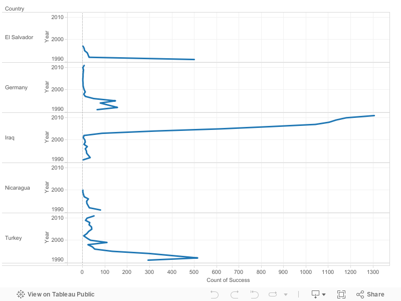
Case 12: Terrorist Cases by Year (Selected Countries)
Unlike the previous visualisations, the visualisation below which we named ‘Macro Perspective of Terrorism (1991-2011)’ was specially created for our final submission. It consists of all 11 variables from the cleaned up dataset. We managed to find several other interesting findings from using this interactive visualisation. Firstly, there are only 3 countries in the world which has been attacked due to abortion related cases. While United States is one of those countries as noted in Case 10, the other 2 countries are Canada and North Ireland. Secondly, India which is known for its well-developed telecommunication network has the highest cases of attack which targets telecommunication. Thirdly, Japan is the only country that has been attacked via radiological means, with a total of 10 cases and all of which occurs in the year 2000. Further research from the raw data reveals that all the attacks happened between 6 to 8 June. This shows that radiological weapon is a rare choice of weapon used by terrorists.
.jpg)
Case 13: Macro Perspective of Terrorism (1991-2011)
With all these findings, we have to make careful selection as to what should be represented in the data. For the first draft, we wanted to focus on general trends regarding the number of attacks by countries, number of attacks by nationalities and fatality rates on a global scale, and then focus specifically on Iraq and US in detail.

We attempted to show how the rankings of Iraq and US could change when compared in different circumstances. This is shown in the infographic with the comparison of number of attacks between Iraq and US, and a comparison of the number of countries Iraqi and US citizen have been attacked in.
Here with the example of tree maps, when the number of terrorist attacks made on Iraq and US are compared based on country, Iraq comes in 1st place with 7771 attacks and 26,837 fatalities while the US comes in 25th place with 569 attacks and 3246 fatalities. However, when both countries are compared in terms of the nationalities being attacked in the number of countries, US comes in 1st place with the US citizen being attacked in 108 countries and Iraq comes in 21st place (excluding Unknown in 2nd place) with the Iraqi citizen being attacked in 18 countries.
 |
| Most Attacked Countries |
+2.jpg) |
| Most Attacked Nationalities (Based On The Number Of Countries They Have Been Attacked) |
There were a lot of interesting data and trends that could be uncovered in our rich dataset but unfortunately, the comments received were that these interesting information were lacking in the infographic. The infographic also lacked details and specific numbers for the readers to make more sense of the data.
Many revisions were made to the infographic, such as combining information to only 1 world map instead of 2. The focus however, would still be on Iraq and US. The new additions of information are the main perpetrators towards Iraqis and US citizens as well as a comparison of the terrorist attack patterns between Iraq and US.
The 4 main
perpetrators for both Iraqis and US citizens are the Taliban, Hezbollah, Palestinians and
Al-Qaeda. Taliban is the top perpetrator towards both Iraqis and US citizens.
For the pattern of attacks in Iraq and US, it is
evident that the number of attacks in US has remained relatively stable
throughout the years while the number for Iraq has increased rapidly since
2003, when the Iraq war started. Thus, there is the use of the missile and
smoke to represent how terrorist attacks in Iraq have taken off since 2003. The
US on the other hand, is represented by buildings as the trend line is
relatively flat.
Design-wise, the infographic was arranged in a
portrait format, so that the reader could have a smooth read between different
sections vertically. We started with a broad perspective involving countries
worldwide, before zooming in on Iraq and US. In addition, warm and
cool colours like orange and blue were contrasted to make the infographic
elements more outstanding. Different shades of blue were used to represent Iraq and US. Lastly, the height of the people from various countries were
varied to show the taller the person, the higher the rank.
 |
| Infographic (Final) |
A note on how to use the interactive visualisation:
The interactive visualisation allows users to have a
macro and micro view of the terrorist attacks that occurred in the period of
the past 2 decades. The visualisation allows filtering through year, success, region, country, target nationality, perpetrators, attack type, weapon type, and target
type. By clicking on one of these filters, the map on the interactive
visualisation would change accordingly. For example, when hijacking from the
attack type is clicked, the user is able to see which countries have the most
number of cases of hijacking that occurred. The intensity of the colour
represents the frequency of attacks. Therefore, the darker the colour, the
higher the number of attacks.

The user can also investigate which nationalities are
the most attacked in any specific countries. This is done by clicking on the country name through the bottom two columns of the visualisation. For example, clicking on Iraq on the bottom left
column will show the top attacked nationalities within Iraq, or clicking on
Iraq at the right column will lead to the number of countries in which Iraqis have
been attacked in. The most attacked nationalities in Iraq is shown below. The
number of countries in which Iraqi citizens have been attacked in is also shown
below.


+%5BScreenshot%5D.jpg)